What makes an ecommerce website successful?
A successful ecommerce website helps the right customer find the right product, understand the offer, and finish buying without unnecessary friction. Attractive design matters, but so do useful product information, trustworthy policies, relevant navigation, and a checkout that works on a phone.
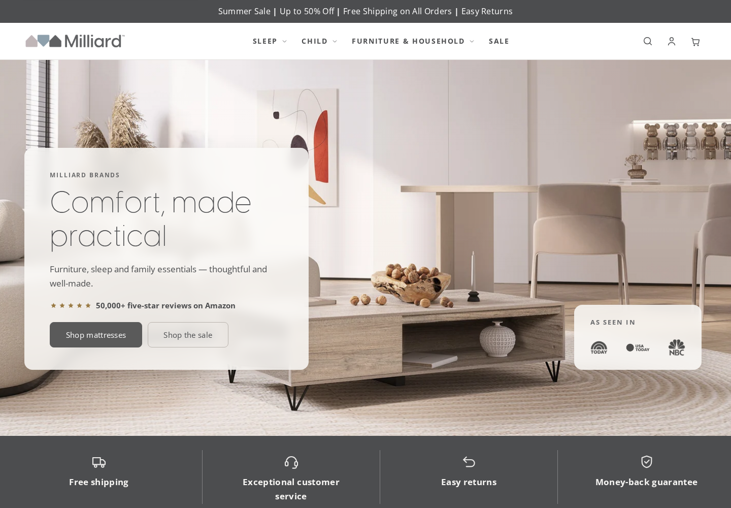
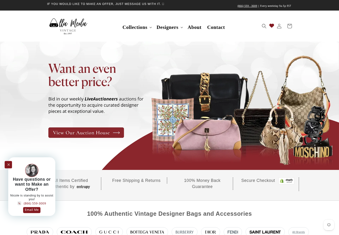
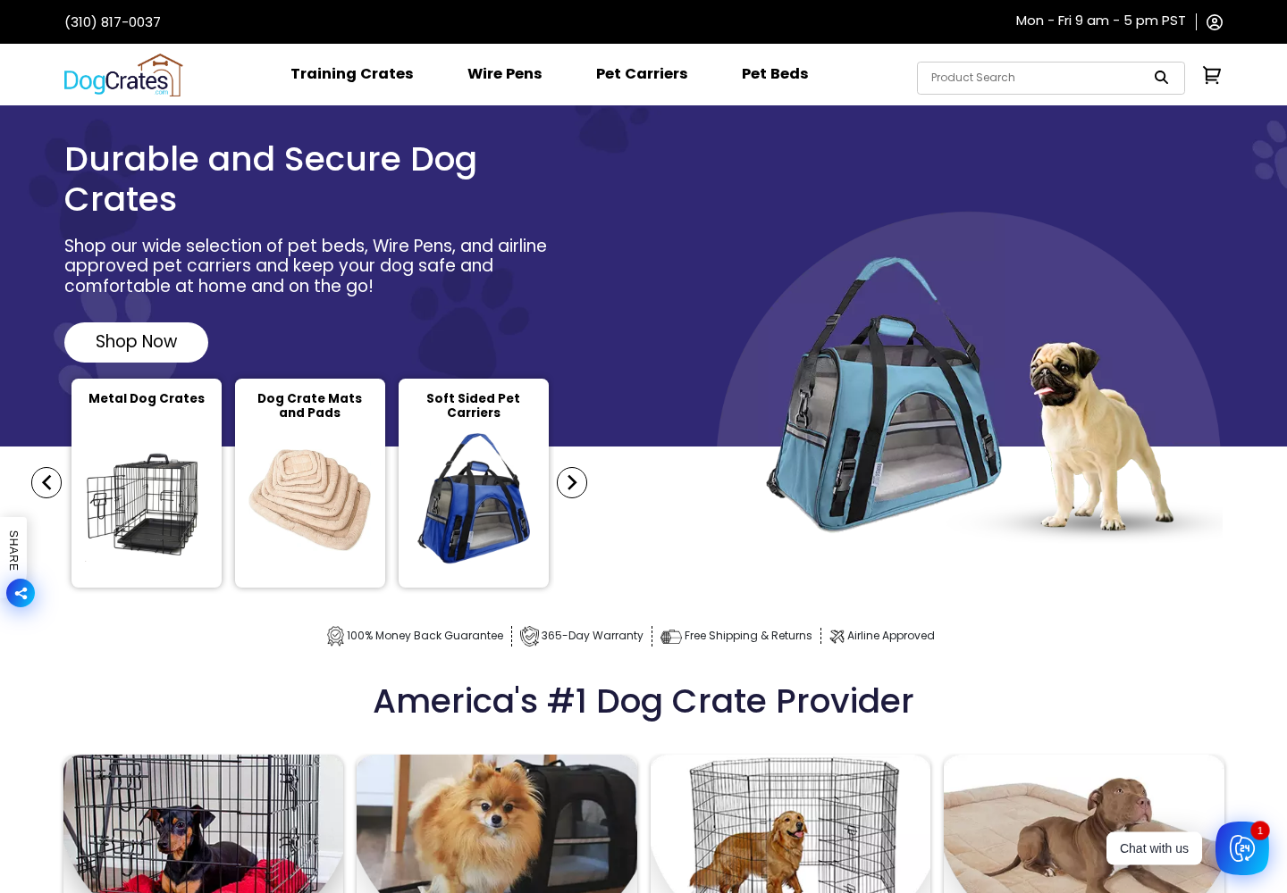
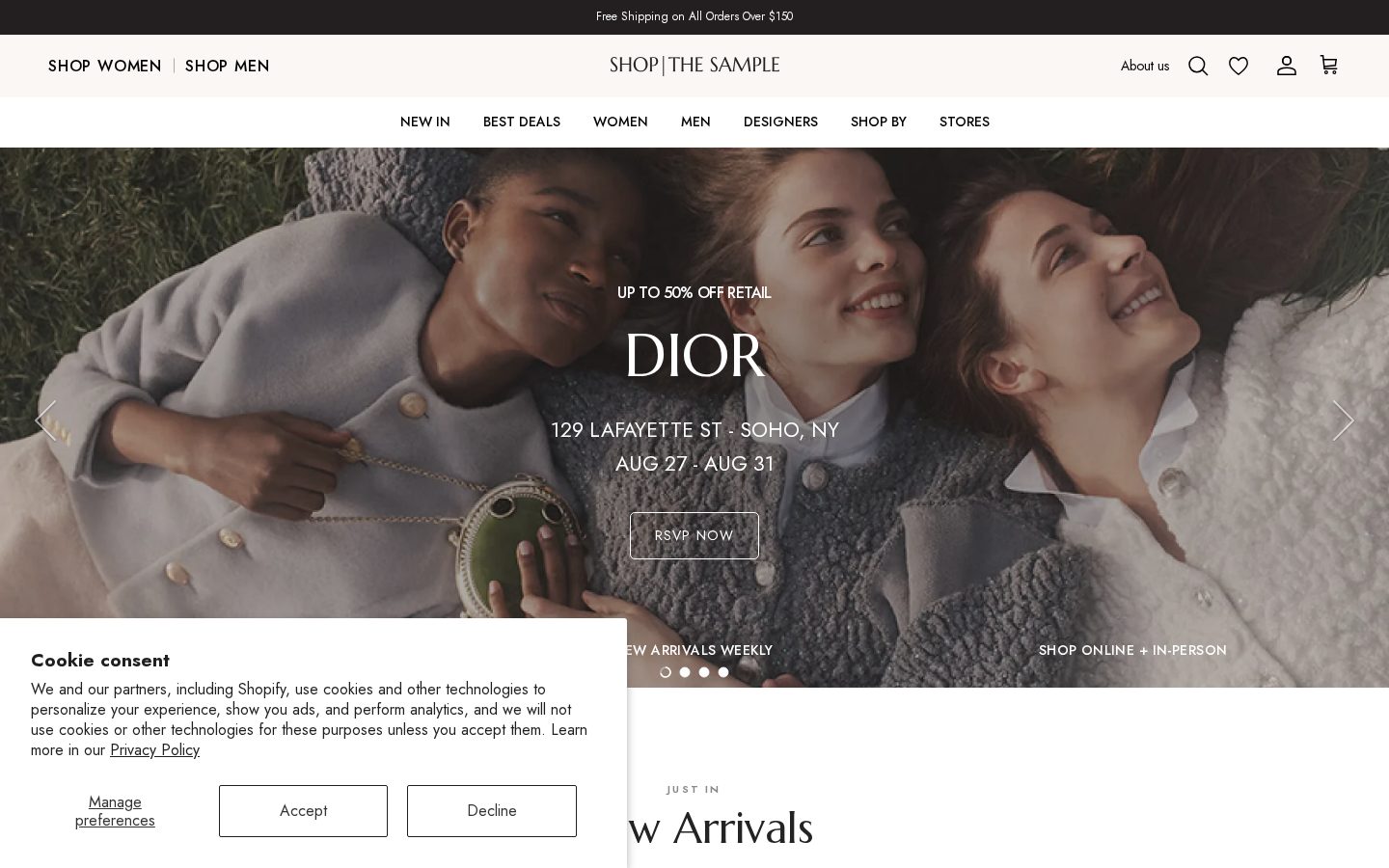
Below are the ten brands from our original article, with a practical lesson for each. These are independent examples, not Falcon clients. We also show ten ecommerce websites from our own portfolio so you can see the difference between inspiration and work we actually built. The examples illustrate design decisions, not verified revenue or conversion-rate comparisons.
1. LEGO: organize around how customers shop
A toy catalog serves several different buyers: a parent choosing by age, a collector looking for a particular theme, and someone shopping for a gift. LEGO is a useful example of organizing a store around those different motivations instead of expecting every visitor to know a product name.
The lesson for your store is to give shoppers more than one sensible entry point. Product type, recipient, use case, and price can all be helpful, provided the menu remains readable. Do not copy a large retailer's entire navigation when your catalog only needs a few clear choices.
- Build collections around real buying questions.
- Give seasonal and gift collections a clear place in navigation.
- Make any loyalty offer understandable before asking someone to join.
2. Chewy: design for the next order, not just the first
Pet supplies often involve repeat purchases. Chewy provides a helpful lens for thinking about replenishment, saved preferences, and customer service as parts of the shopping experience rather than separate marketing activities.
For a repeat-order business, the important question is how quickly an existing customer can find the same item again. If you offer recurring deliveries, show the schedule, price, and cancellation terms clearly. A subscription should solve a customer problem, not hide an obligation.
- Make reordering easy from an account or confirmation email.
- Explain recurring-payment terms before checkout.
- Keep support and delivery information close to the purchase decision.
3. GlassesUSA: help shoppers make a confident choice
Eyewear buyers need more than an attractive product photo. Fit, prescription options, lens choices, and return policies all influence the decision. GlassesUSA is an example worth studying when a customer needs help narrowing down a large assortment.
Apply this to any product with meaningful variations. Explain which choices affect price and compatibility, and avoid making a customer discover an essential requirement at the final step. Buying guidance can be more valuable than another promotional banner.
- Show selection criteria alongside the product.
- Explain warranties and returns in plain language.
- Offer filters that reflect real customer requirements.
4. Newegg: make technical catalogs navigable
Technical buyers may arrive with a manufacturer, model number, or specification in mind. Newegg illustrates why a deep catalog needs more than a visually appealing homepage: category structure, useful filters, and clear product specifications support comparison shopping.
A small technical store can apply the same principle without building a giant menu. Start with the attributes customers actually use to choose. Keep compatibility information consistent across product pages and let users return to their filtered results without starting over.
- Support model-number and specification searches.
- Use consistent units and product attributes.
- Preserve useful browsing context during comparison.
Is your store making buying harder than it should?
Let’s look at your website5. Barnes & Noble: make discovery feel curated
A bookstore sells familiar titles alongside products a customer has never heard of. Barnes & Noble is a useful example of editorial merchandising: organizing products through interests, authors, new releases, and recommendations rather than relying on a single catalog grid.
Your equivalent might be a seasonal collection, a staff selection, or a buying guide. Curated collections should earn their place by helping someone choose, not by creating a new page for every keyword variation. Keep the collection current and its product links working.
- Create collections with a clear shopping purpose.
- Connect editorial content to relevant products.
- Let customers keep browsing after adding an item.
6. Harry's: make the core offer easy to understand
Harry's is a useful reference for a focused direct-to-consumer offer. When a store starts with a narrow set of products, a clear explanation of the product and purchase options often serves visitors better than an elaborate homepage.
The lesson is not that every brand needs a subscription. It is that customers should understand what they receive, what it costs, and what happens next. Give supporting products room without making the original offer harder to find.
- Explain the main product before introducing extras.
- Distinguish one-time and recurring purchases.
- Use photography that shows the product, not just a mood.
7. Stitch Fix: use guided selling when choice is difficult
Stitch Fix is associated with a personalized styling experience. It is a useful example for businesses where the customer may not know exactly which product to choose, but can describe their preferences or circumstances.
A quiz or guided selector should reduce uncertainty, not simply collect an email address. Keep questions relevant, explain the result, and let customers browse normally if they do not want to complete a quiz. Test whether the guidance improves purchases instead of assuming more interaction is always better.
- Ask questions that change the recommendation.
- Explain why a product fits the shopper's answers.
- Provide a direct shopping path alongside the guided one.
8. Wayfair: answer practical questions before checkout
Furniture creates buying questions that a thumbnail cannot answer. Wayfair is a useful starting point for considering dimensions, materials, delivery details, and product comparison across a broad home category.
For a bedding or furniture store, product information should help a customer judge whether an item will fit their space and needs. Include readable measurements and useful images. Make delivery limitations visible before someone invests time building a cart.
- Show dimensions and materials consistently.
- Use images that establish size and context.
- Explain shipping constraints near the product.
9. ILIA Beauty: reduce uncertainty about the product
Beauty shoppers often need to evaluate shade, ingredients, finish, and application. ILIA Beauty provides a useful example for thinking about educational content alongside product merchandising, especially when a buyer cannot try the item in person.
For your store, identify the questions that prevent a first purchase. Show honest product imagery and explain claims with evidence. If you offer shade or product guidance, keep it useful on mobile and make its limitations clear rather than promising a perfect match.
- Answer product-specific questions, not just brand questions.
- Use credible explanations for ingredient and performance claims.
- Connect buying guidance to the appropriate product variants.
10. The Home Depot: connect online shopping to fulfillment
The Home Depot is a useful reference when online buying and physical fulfillment are connected. Availability, delivery, and collection options can be as important as the product description, especially for a time-sensitive purchase.
If your business has warehouses, stores, or local delivery areas, the website should accurately reflect what customers can receive and when. Do not offer a pickup option that your operations cannot support. Recently viewed products and saved lists can also help customers finish a multi-item project.
- Show fulfillment choices early enough to influence the decision.
- Keep availability aligned with the inventory system.
- Support shopping lists or repeat visits when the purchase is complex.
Turn inspiration into a plan for your store
Start with your own buying journey. Watch where visitors lose context, cannot answer a product question, or hesitate at checkout. Choose the smallest change that addresses a documented problem and measure the result against a stable baseline.
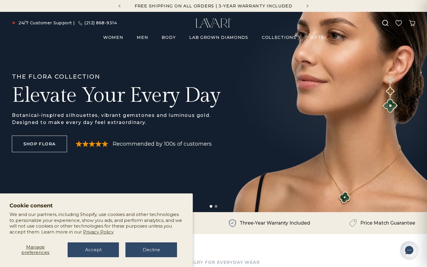
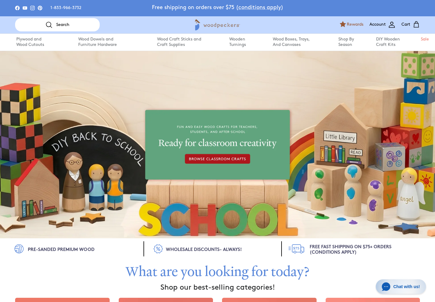
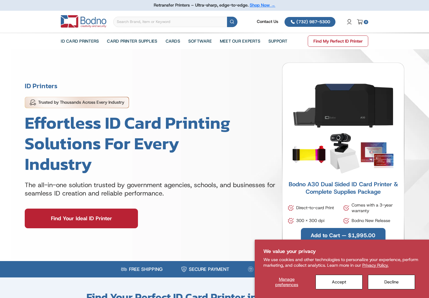
Falcon's ecommerce portfolio includes glassware, bedding, fashion, jewelry, pet products, craft supplies, and technical catalogs. Bring us your current website, your product catalog, and the biggest obstacle to growth. We can discuss whether the next step is design, development, SEO, or improving the store you already have.