Mobile Friendly Website Design – How to Check & Why It Matters

Mobile Friendly Website Design – How to Check & Why It Matters
October 17, 2019
Recent Blogs

Rethinking “Business Sense”: Why Visionaries Often Undervalue Themselves
August 12, 2025

Law Firm SEO: Search Engine Optimization for Attorneys
March 25, 2025

Unlocking Hyper-Local SEO Success: A Revolutionary Approach by Los Angeles SEO Group
March 24, 2025

Why Expert SEO Help Is the Key to Unlocking Your Business’s Online Success
February 17, 2025

The Rapid Evolution of SEO: Adapting to Google’s Latest Changes
May 24, 2024

Web Design Los Angeles: Responsive Websites and Web Development
May 16, 2024

Digital Marketing Services in Los Angeles
October 4, 2023
 You may have heard the term ‘mobile responsive website’ or ‘mobile friendly’ website design when it comes to hiring a web design company for your next project. It’s a term often used as a selling point for websites, and believe it or not, it really does matter! Simply put, a mobile friendly website is one that has phone optimized design, or in other words, changes the content layout and scale depending on the size of the monitor you’re looking at the website on. Nowadays this feature and process of web design and development have never been more important. In a poll done in 2015, 52.7 percent of all users accessed the web on their mobile phones or tablets. That means that if your website is not mobile optimized you’re losing out on 50% of all potential users, sales, and future clients! That’s a pretty big deal if you ask us. But don’t fret, there are some simple steps you can take to ensure your website is truly functioning on all platforms and devices.
Desktop & Mobile Designs
During the design and development phase of your project, it may be in your best interested to request, commission, or design two or three variations of your different website pages. The two most important variations are of course desktop and mobile but creating a third design for tablet sizes may also be a beneficial option. When it comes to the development phase these mockup designs will be invaluable when it comes to the clarity and communication that’s necessary to achieve a great design. It acts as a roadmap for the developer(s) and allows you to work out any design kinks early on before features become more concrete, and in turn, harder and more expensive to alter.
Custom coding these intricacies can be a huge undertaking, so be wary of template services or pre-made website designs that promise mobile friendliness. Oftentimes the end result of these types of services are buggy and unusable on mobile due to the inability to custom code responsiveness. On the flip side, if you’re going through a website design company that handles everything from design to development they most likely have the multi-layered decision making process in place to ensure what’s called responsive design. Responsive design is a different approach to mobile optimization where the website’s hard coding can alter depending on every and any screen size making a mobile mockup design irrelevant. This is achieved by using column design which allows for free scaling page images and elements ensuring a crisp layout on any device.
One point to note when thinking about mobile compatibility is that it is now a factor Google and other search engines use to gauge a page’s success. Previously these engines used ‘screenshots’ of websites to gauge readability and reliability, but now they’re also capable of taking screenshots of mobile views. We’ll go over how to check this for yourself shortly. Just to keep in mind that the more mobile friendly the page is for the user, the higher Google will rank your website and allow it to become a trusted source of information.
Checking For Yourself
I’ve created this simple and handy guide to help you check if your website is mobile optimized and get you started in the right direction to improving your website’s mobile readability.
Step 1: Download Google Chrome

Google offers a free browser called Chrome that comes bundled with development tools and features. Their debug mode is the reason to use this browser as your method of choice and will be a huge help in looking for mobile responsiveness.
Step 2: Use the Inspect Tool
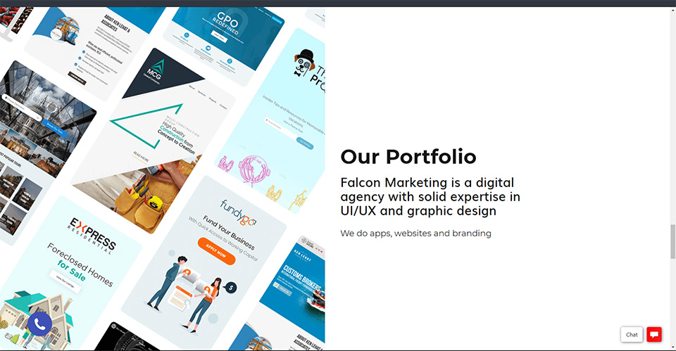
Right-click and use ‘Inspect’ button at the bottom of the drop-down or hit ctrl+shift+i for a simple and quick hotkey.
Step 3: Switch to Responsive Mode
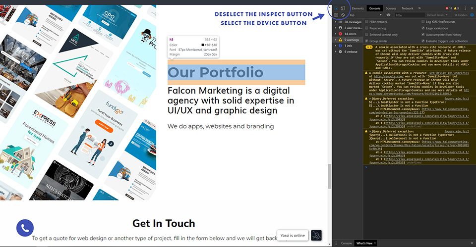
The first thing you’ll see inside the inspect mode might be a little overwhelming, but the majority of tools you don’t have to worry about. For right now all you need to do is deselect the inspect element button in the corner and instead select the device view button.
Step 4: Device Sizing
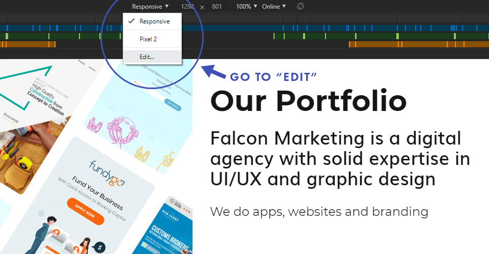
After you switch to device mode you’ll see one of two things: the first thing you’ll notice is colored bars running along the top of the window. These are simply indicators that outline the ‘threshold’ that your programmer or developer has already included in the code. Essentially, as soon as you pass a certain threshold of size the site design should adjust to compensate for the new ratio. The second thing you’ll notice is a drop-down with common device sizes. Since we’re testing for our own phone size, you’ll want to hit ‘edit’ on this drop-down so we can input a custom size.
Step 5: Add Your Device
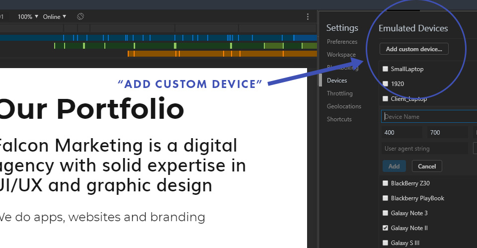
A new checklist will appear that dictates the different device sizes you can select from the drop-down. Many of the common sizes are already included but if you’re on a different device like me (I use a Google Pixel 2) then you’ll want to input the name of the device and your custom size ratio.
Step 6: Check for Details
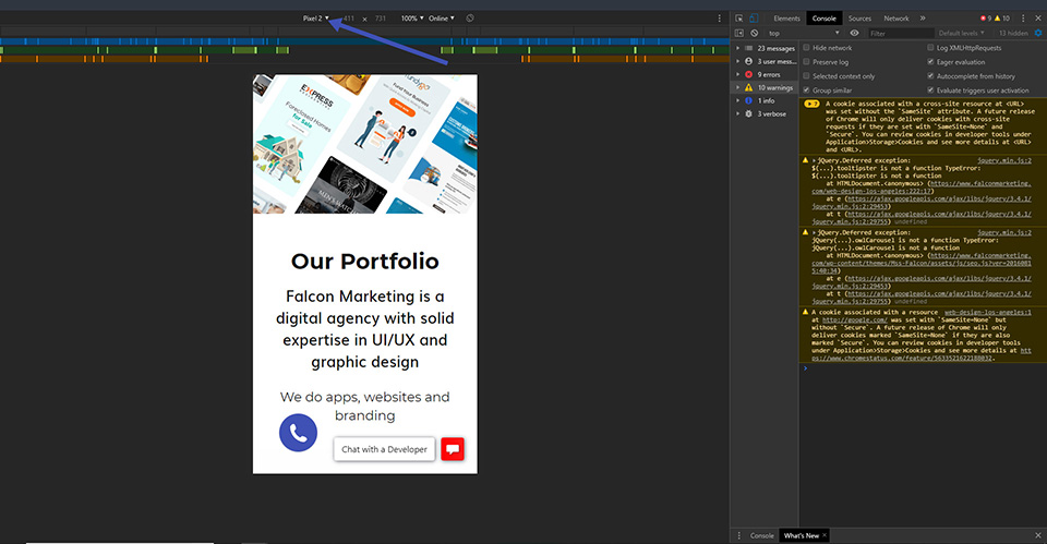
As you can see our website is already optimized for mobile viewing, but in the case that you do see any unwanted text or image overlaps or broken pages, it needs to be repaired by a developer who has experience with mobile responsiveness. Here at Falcon Marketing, all of the websites we create are already built with mobile responsiveness in mind.

